Monday, July 14, 2014

Rules for Illusion of Life and Hockney's Secret Knowledge

https://www.youtube.com/watch?v=JKbFZIpNK10

https://www.youtube.com/watch?v=l-KtwW6eptM

https://www.youtube.com/watch?v=tFhqEupQviU

Tuesday, July 8, 2014

COMICS CLASS #2

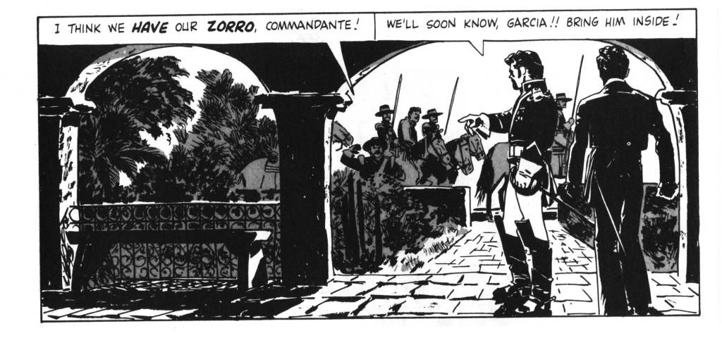
Due to how labor intensive creating sequential art is, we will begin immediately with our 6-10 page graphic novels.  In this blog post, I will provide you with some diagrams to showcase the variety of camera angles and integers of time that are available to you as a sequential artist.

WALLY WOOD'S 22 PANELS THAT ALWAYS WORK


 photo 22panels_zps34bef039.jpg

This diagram was created by Wally Wood, a cartoonist whose career spanned all the way through EC Horror comics and beyond.  He worked up until his death in 1981.  Occasionally you will have moments in your comics where there isn't a lot of kinetic energy; Heavy dialogue panels,  explanation panels, etc.  You can spice up these segments of your story by using interesting cinematography.  Study these camera angles and think about what would be an composition for the moments in your narratives.

 photo intervalsoftime_zpsf6e2a0a7.jpg

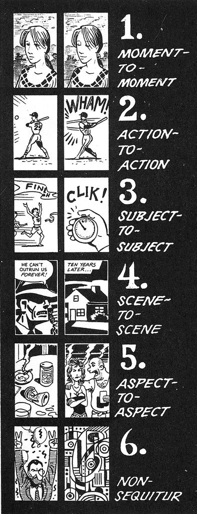
Here is a diagram that shows 6 types of intervals of time in comics (I snagged it from Scott McCloud's UNDERSTANDING COMICS).  Consider how much TIME passes in your narrative, how many panels you want to use to illustrate that amount of time.


 photo mccloud-uc-triangle_zps31167561.jpg
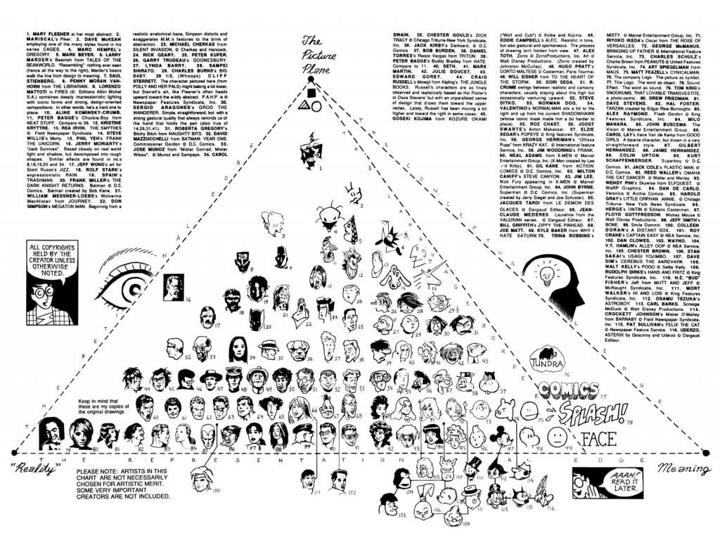
Here is Scott McCloud's triangle of comic book aesthetics.  On the top is abstraction, to the right is iconic art and to the left is realism.  At your ages, I wouldn't get too scared about concentrating on an aesthetic that meets your personality.  Allow your drawings to come naturally, you can think about aesthetic once you're in college.  At the time you should be considering quantity and finishing projects.  A problem with young students and comics is their inability to finish a piece of work.  You can be the best renderer in the world, if the comic isn't finished at the end of the month, it doesn't mean anything.

Suggested process for completeing a 6-10 page comic.

1.  Synopsis.  Run your narrative through the Will Eisner story structure; introduction, problem, dealing with problem, solution, ending.  While story structure should be broken because the rules were meant to be broken, you need to fully understand these rules of narrative before you can truly manipulate them to your liking.
2.  Thumbnails.  Adapt the synopsis and organize the narrative by blocking out the rythmn of events.  How many pages does the introduction deserve or need?  The problem? The solution, etc.
2.  Pencils.  While the process of penciling to inking is becoming a relic now that just about anything can be scanned and printed, having a first draft of your work will allow you to edit the narrative in real time.
3.  INKING.  Using a light box or light table (the school should have them) trace over your pencils with a final ink.  You can also PAINT using a lightbox (i'll bring in original art as an example).
4.  SCANNING, publishing to the web.
Pretty self explainatory.

Good luck!  Lastly, I urge you all to lean towards simplicity in your narratives as opposed to attempting to develop complex, epic plots.  This is due to the lack of time we have in this class.
 

Animated GIFs

 photo misterturnbullrunsequence_zpsb07f6532.gif 

Today in class we will begin the ambitious task of creating animated GIFs.  While this may seem daunting to those unfamiliar with photoshop, if you are able to create an animated GIF in photoshop, everything else will be a lot easier.  By learning how to make an animated gif, you will have to comprehend the use of layers, filters and the history application.  Because the exercise is 

The above animation is a simple run sequence.  It operates the exact same way a flipbook would operate and the process mimics the animation process animators have used since the dawn of the beginning of the craft. 

A common mistake made by novice GIF creators is them thinking that when creating each individual frame, the entire figure/character must be redrawn every time.  YOU ONLY HAVE TO DRAW MULTIPLES OF WHAT MOVES.  Besides that, here are some rules for making your animations appear more realistic:

1.  Squash and Stretch
- This action give the illusion of weight and volume to a character as it moves.
2.  Anticipation
-  Prepares the audience for a major action the character is ABOUT to perform.  Ex:  the windup before a baseball pitcher throws a ball.  Ex 2:  A boxer pulling his arm back before throwing a punch.
3.  Staging - Presentation of an idea so it is clear, AKA paying attention to composition (which is paramount for all types of design/art).
4.  Straight ahead & pose to pose -
by breaking down an animation cycle into three dominate drawings, in the beginning, middle and end, one can grasp a better sense of what is significant in the cycle.
5.  Follow through and overlapping -
When the main part of the body stops, all other parts need to catch up.  Nothing stops all at once.
6.  Slow in and slow out -
When we move, there is always acceleration.  Humans, cars, nothing in the universe goes from 1 mph to 90 mph without going through all the numbers in between.   This is also true when something slows down.

Student examples from last year's digital illustration class -

 photo grumpy-british-man_zps4bd52486.gif


 photo Puppy_zpsb45da6bc.gif


 photo animation_zps40110db0.gif

 photo blowingbubblesanimation_zpsa8c2d452.gif

 photo 1st-Animation-Recovered_zps351f7837.gif  photo Facey3_zps47956e2b.gif

Sunday, July 6, 2014

Class #1 Digital Illustration

 photo real-life-photoshop-550x344_zpsb4e6a9f1.jpg

Welcome to Digital Illustration 2014!!!  I am your teacher, Jack Turnbull, who will help you get a step closer to mastering visual communication while simultaneously helping you use a computer as a tool to communicate visual.   In this class we will primarily use the program Adobe Photoshop, which is vital to a digital program originally intended for photographers to edit their works but has gradually shifted to become an industry standard in the realm of digital illustration and design.

 photo photoshop_zps0e25260d.jpg Outcomes and Goals
* Students will be comfortable using a Wacom Tablet with a vocabulary of keyboard commands (example: command "minus" to minimize a screen)
* Students will be comfortable with Layers in photoshop and how to manage design files
* Students will be comfortable making animated GIFs as well as non-sequential art.
* Students will receive an introductory illustration concept class.
* Students will leave with roughly 6-10 digital illustrations, printed and on CD.


CLASS ONE:  COLOR AS COMMUNICATOR

1.  Read this link.
2.  Choose one of the three images below to color using photoshop with a limited color palette from below.

   photo drifitng_zps9956a700.jpg


 photo colorworkshop_zpsa74094bd.jpg

COLOR PALETTES:
 photo walt_zps8239f82f.jpg photo concertlights_zpsb9895c42.jpg photo Depression_zpse3441ec8.jpg


<div> text-align: justify;">
NOTES:


Giotto:  Giotto uses yellow ochre for the voluminous robe of Judas.  "Come on, are you YELLOW?" The color attracts the eye to the focus of the composition, but is also associated with evil and, more specifically, betrayal and cowardice.  The meaning of this color would have been clear to Renaissance viewers.  Other shades of yellow were used to identify St. Peter and St. Joseph.  In non christian colors, yellow has different associations: worn by the emperor of imperial China.   

 photo 800px-Cat_and_Bird_by_Paul_Klee_1928_oil_and_ink_on_gessoed_canvas_mounted_on_wood_1928_Museum_of_Modern_Art_New_York_City_zps9a9fabf7.jpg


"Colour has taken possession of me; no longer do I have to chase after it, I know that it has hold of me forever... Colour and I are one. I am a painter." -Paul Klee

 photo Actaeon_zpsb6d913bf.jpg

Venice was a port city during the 16th century and as a result their painters obtained paints from strange parts of the world.  Borrowed from the east (from trade ships);  Realgar (Orange-Red), and Orpiment (Yellow).  THese regularly appear in Persian manuscript illuminations, and surface in Venetian painting in the 1490s.  Realgar provided the Italians with the first true orange (previously they had mixed red and yellow) and the two pigments combined produced glorious reddish golds.    Figures and settings merge in a haze of light and atmosphere. 

 photo redroom_zps813305fe.jpg


Henri Matisse:  "When I Paint Green, it doesn't mean grass; when I paint blue, it doesn't mean sky.  Matisse freed color once and for all from its literal, descriptive role - his choice of shaes was governed by "Observation", "Feeling", and "the very nature of each experience."  (A Faurve; Wild Beast)

 photo 294px-Whistlerwhite393pix_zpsb4537a1d.jpg


"The White Girl":  (1862)The painting epitomizes his theory that art should essentially be concerned with the beautiful arrangement of colors in harmony, not with the accurate portrayal of the natural world.

While working: Nature's hues become bluer over distance, as they penetrate atmospheric mists and vapors.  (see Leonardo's naturalism).  Reds tend to advance.